Sentz Global
Helping global payment app, Sentz, launch in Nigeria
How did I help:
About Sentz
Sentz is a global payment app that enables users, especially freelancers and creators, to send and receive payments internationally quickly and easily, offering features like invoice creation, stablecoin storage, and low transaction fees.

My work at Sentz
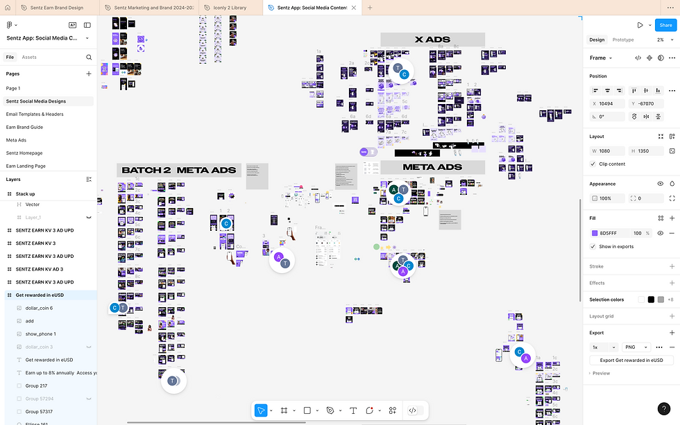
I joined the Sentz team as a Brand Designer with the task of aligning strategy to visuals and then introducing the global payment app to the Nigerian audience. Although Sentz had a logo, color palette, and typeface, it lacked a clear visual direction—something I was brought on to define. From designing multiple merch items for our first activation event to building a strong social media presence with engaging, thoughtful, and on-brand visuals and ads (Meta, Google, and X), as well as crafting polished email templates, the entire experience was both enriching and exciting, adding depth and enjoyment to my creative journey.
Overview
The creative direction for Sentz was built around a bold and playful personality — one that would resonate with a youthful, energetic audience. This tone guided every visual and verbal expression of the brand, from typography and color to content and campaign design.

The Problem
Sentz aimed to embody a fun, Gen Z–friendly brand that was visually engaging and full of personality. While the existing visual direction had vibrant elements, it lacked consistency and cohesion, resulting in a chaotic brand expression. This inconsistency posed a threat to brand trust — a critical element for any fintech brand. Without a clear and unified visual system, building user confidence in the short and long term would be a challenge.

The Solution
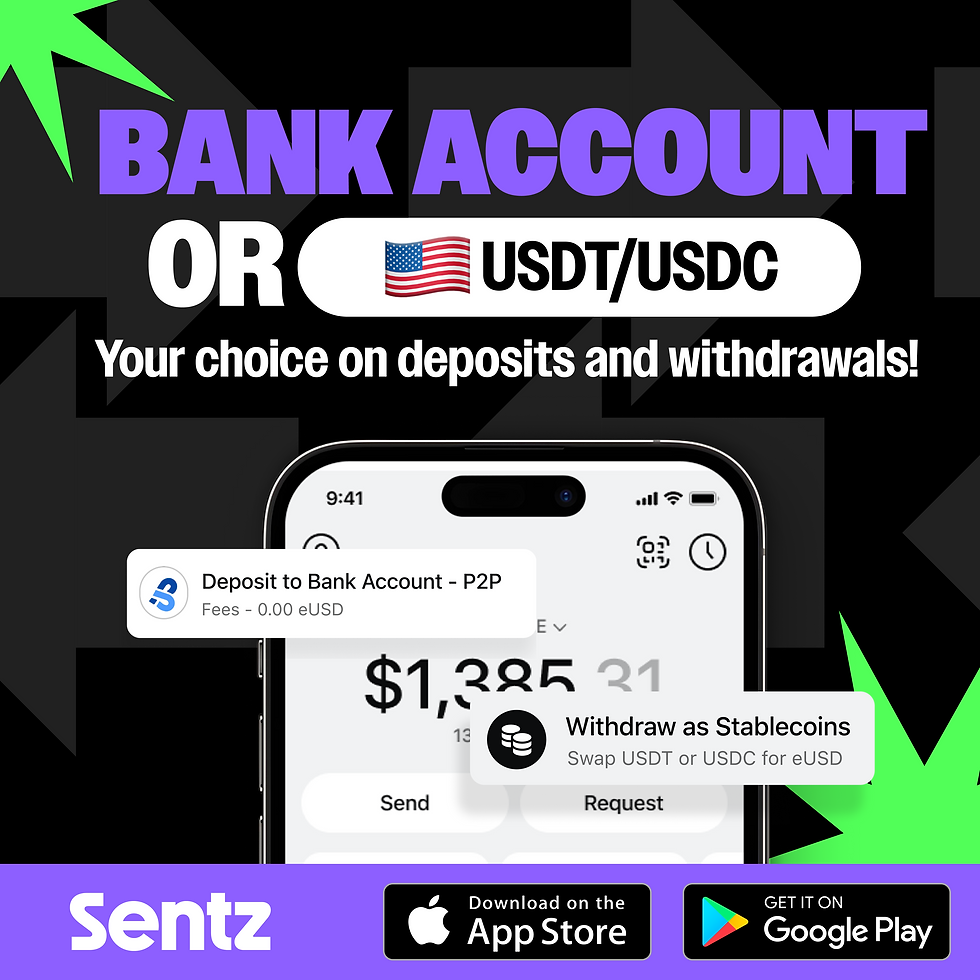
We decided to approach solving the problem by auditing Sentz's existing visual language and course-correct the visual direction without alienating the target audience. I worked on unifying the brand visually, without losing Its soul and retaining the playfulness and bold identity while also introducing structure and consistency. As a result brand equity was increased. The new direction ensured the Sentz brand fit right into the visual sphere of modern fintech startups without looking like a clone. I maintained already existing design elements and then introduced 3d shapes and elements. This brought a new feel to the overall visual language. I made use of the app UI in designs to foster familiarity as the audience interacted with social media posts and ads.

Social Media
The first line of action was building an online presence that communicated what Sentz is. I worked on visuals for social media platforms, maintaining brand consistency and ensuring cohesion.

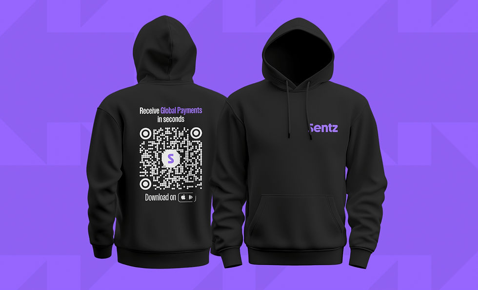
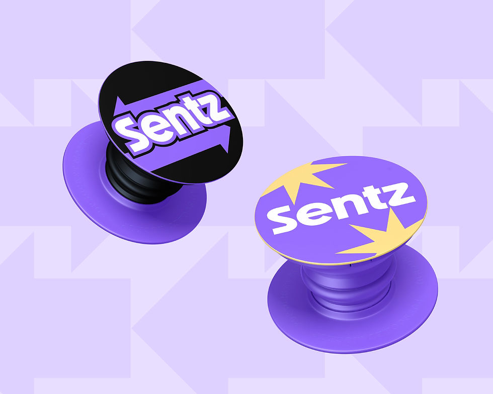
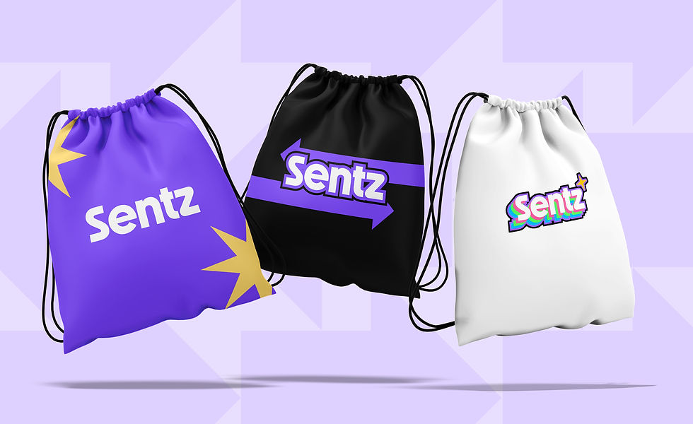
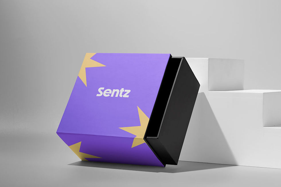
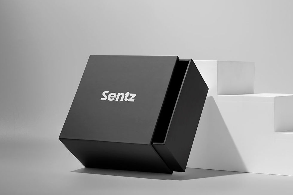
Merch
As part of the refreshed brand direction at Sentz, I designed merchandise that brought the brand’s visual identity to life. These items were shared as onboarding gifts for new employees and distributed at brand activations, helping reinforce internal culture and create a memorable brand experience.
Purpose:
-
Strengthen employee connection to the brand
-
Create visibility and excitement during events
-
Extend the brand’s personality beyond digital touchpoints


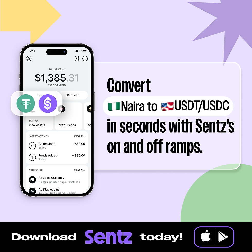
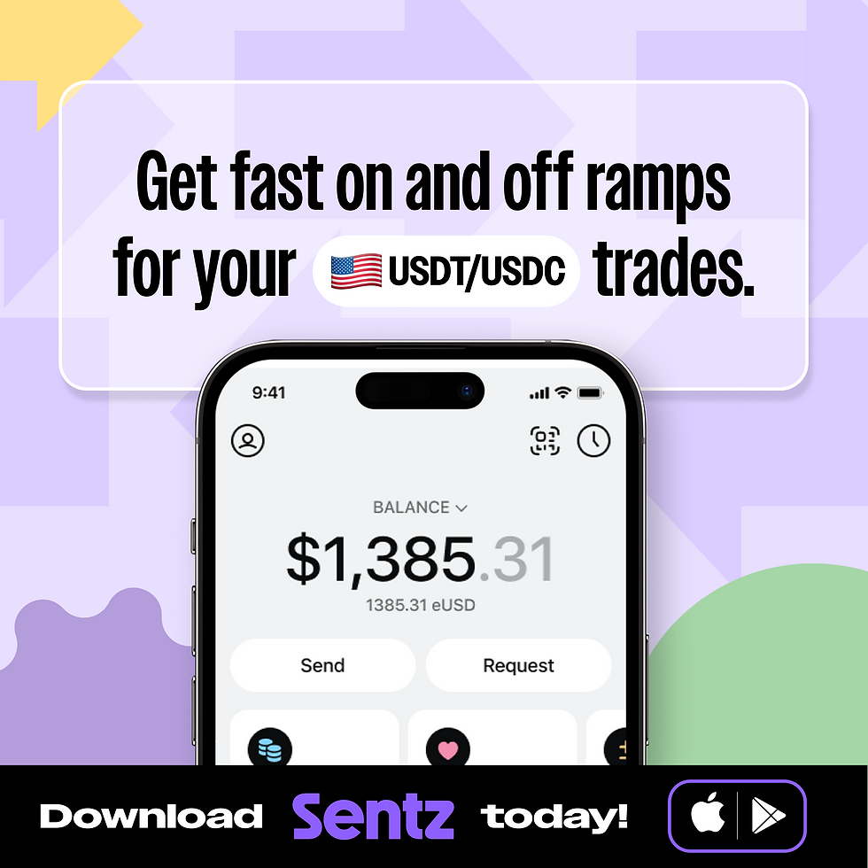
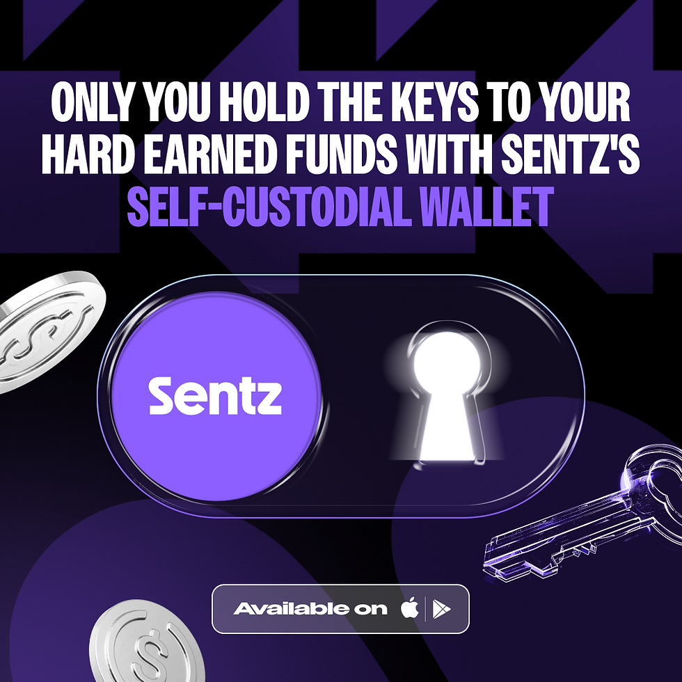
Ads
Platforms: Meta, Google, X (formerly Twitter)
Tools: Figma, Photoshop
I crafted performance-driven ad creatives tailored to each platform's format and audience behavior while maintaining Sentz’s bold, playful brand identity. The ads were part of seasonal and always-on campaigns, optimized for mobile-first experiences.
Impact
-
Boosted campaign CTR by up to 27% compared to previous assets
-
Maintained 100% brand consistency across ad formats and placements
-
Helped improve ad recall through visually consistent storytelling
Here are some of the assets created and used on a batch of Ads...

Ad Visuals
Here are some of the actual ads I designed for Meta, Google and X. These ads were resized according to the requirements of the platforms


More ad assets


More Ad Visuals


Email Marketing
At Sentz, I designed visually cohesive and mobile-responsive email templates using Figma, aligned with the brand’s playful and bold identity. These designs were then implemented in Braze for campaign deployment. The goal was to maintain consistency across customer touchpoints and increase engagement. The improved email experience contributed to higher open and click-through rates, reinforcing brand perception and improving communication flow with customers.

Figma Playground 😁
Its always a lot of work but i is always worth it.


© 2025 TOLU IYOGUN. BUILT BY ME ♥
ALL RIGHTS RESERVED